
Color Psychology in Bio Links
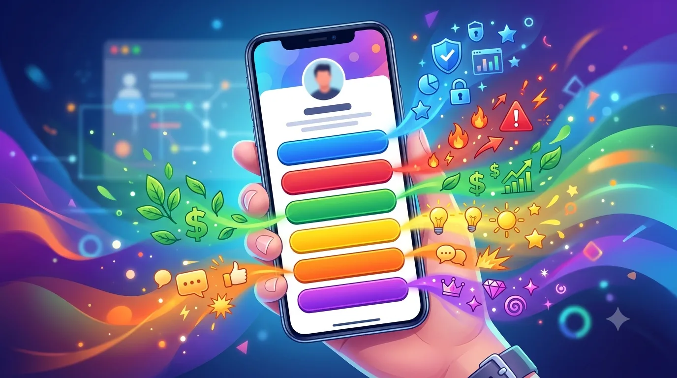
Color shapes a visitor's first impression of your page before they read a single word. A bio link page has two or three colors, and each one has a job: the background sets the stage, the accent color shows where to tap, and the text color determines readability.
Stick to one accent color
Your buttons and featured block should share the same color. Visitors learn it once: “this color is clickable”. In LinkSpot palettes, the accent is derived from a single value; switch the palette and every button changes with it.
What colors communicate
- Blue: trust and technology. Services, consulting, software.
- Green: nature and health. Food, fitness, sustainable brands.
- Orange and yellow: energy and a sense of a deal. Powerful for campaign buttons, exhausting across a whole page.
- Black and dark gray: luxury and simplicity. Photographers, designers, fashion.
- Pastels: soft and personal. Personal blogs, handmade products.
Contrast is readability
You need a contrast ratio of at least 4.5:1 between text and background. Light gray text on a dark navy background looks elegant but is unreadable on a small screen. The theme preview in the editor warns you about low-contrast choices.
Dark mode
If a visitor's device is in dark mode, your page can adapt too. On dark themes, pick an accent one shade lighter; the same blue looks duller in the dark.
Test it
Spend a week with each of two palettes and compare the click-through rate in the Analytics tab. Color debates end with numbers, not gut feeling.